
Matching Your Blinds to Your Walls
Why Your Wall Colour Matters
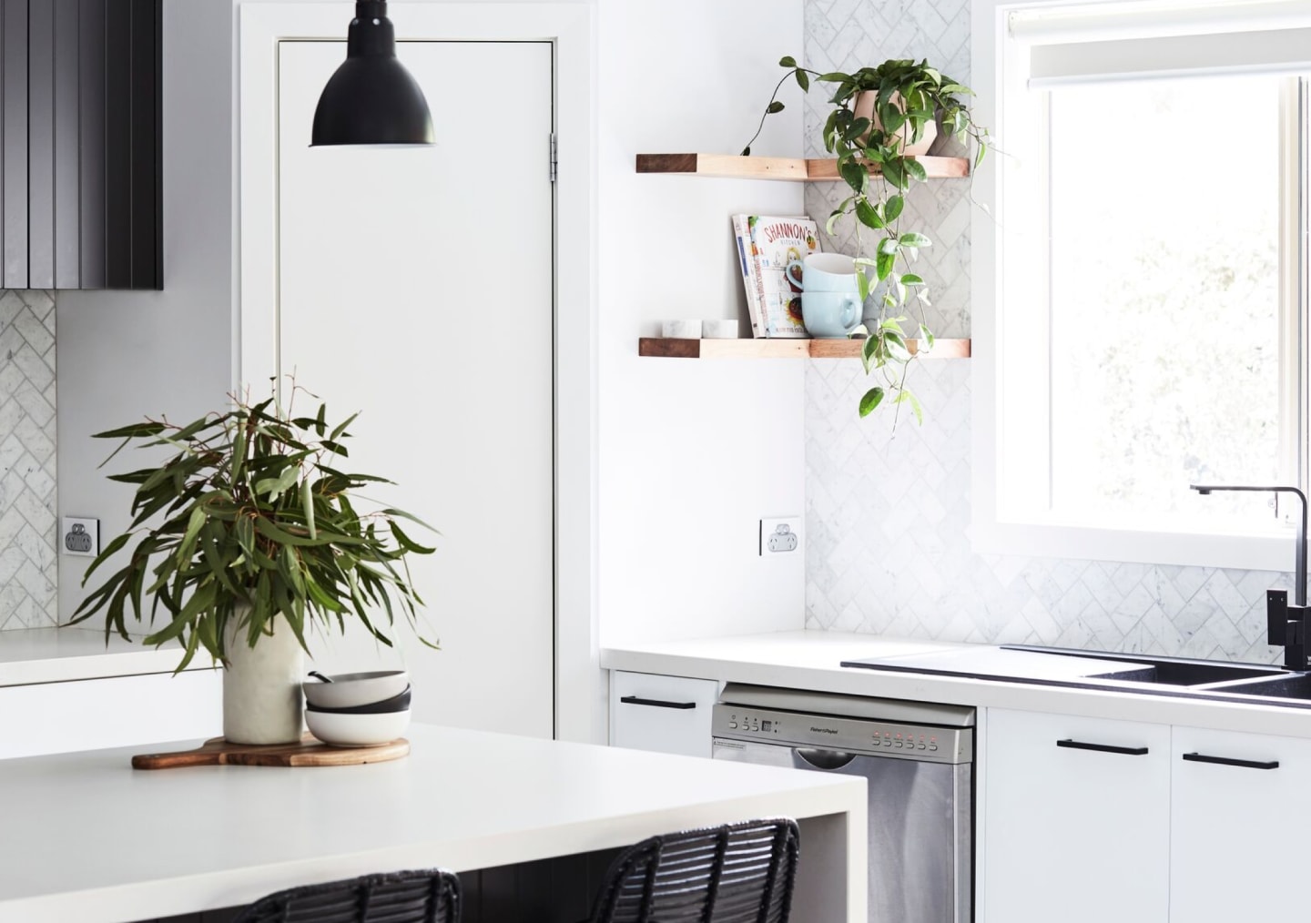
Choosing the right blinds starts with understanding your paint colour. White paints may seem simple, but their cool, neutral or warm undertones can significantly impact how your window furnishings look in the space.
Matching your blinds to your wall colour helps create a cohesive, balanced feel. Whether you want your window furnishings to blend in or subtly contrast, getting the tone right is key.
Note: These recommendations are a guide to help with sample selection, not exact matches. Lighting in your home will affect how both paint and fabrics appear. Always test and colour match with our free samples in your space before making a final choice.
Neutral White Paint:
Example: Dulux Vivid White (A bright, true white with no strong warm or cool undertones.)
Blockout Blind Options:
Kew in Natural
Focus in Chalk
Cool White Paint:
Example: Dulux White on White (A sharp white with subtle grey undertones)
Blockout Blind Options:
One Block in Ice
Qube in Cross
Warm White Paint:
Example: Dulux Natural White (A warm off-white with soft beige or yellow undertones)
Blockout Blind Options:
One Block in Sand
Sanctuary in Marble
Lighting Changes Everything
Paint and fabric tones don’t stay consistent throughout the day. Sunlight, shade, and artificial light can shift how warm or cool they appear.
To get the best match:
View your fabric samples at different times of day.
Hold samples up next to your painted walls, in natural and artificial light.
If you’re layering sheers and blockouts, view them together to ensure the tones and textures work in harmony.
Taking the time to test your samples in the actual space will give you the confidence that your final choice is the right one.